Best Colors to Increase Online Sales: A Guide for Your Ecommerce
Discover how color psychology can boost your ecommerce sales: pick strategic palettes by industry, run A/B tests, and make your CTA stand out to maximize conversions.

In ecommerce, every second counts and every visual element has one purpose: to sell. Many entrepreneurs focus only on the design or functionality of their online store, but overlook one detail that can change everything: color.
Choosing the right colors isn't just a matter of aesthetics. A strong color strategy can help you attract more clicks, increase time on site, build trust, and, above all, close more sales.
In this guide you'll discover:
✅ Recommended color palettes by industry
✅ Why each color triggers emotions and drives purchases.
✅ How to apply your palette to stand out and reinforce your brand.
✅ Practical tips
Why does color impact your conversions?
Color psychology isn't a trend, it's science applied to marketing. Here are the three reasons a good palette can grow your revenue:
- It triggers emotions: Red creates urgency, blue conveys trust, green suggests freshness. And that directly impacts buyer behavior.
- It influences purchase decisions: A well-placed orange or yellow button can increase your clicks. A distracting background can ruin a sale.
- It reinforces your brand: A consistent, well-applied palette makes your store memorable and trustworthy. And that drives repeat purchases.
Using colors for online stores strategically is essential to improve the user experience and increase conversion rates.
How to choose your color palette by industry
Keep in mind that these recommendations are strategic guidelines, not fixed rules. Adjust each color to your brand's identity, goals, and audience. Below are recommendations based on your ecommerce industry:
1. Fashion and clothing stores

- Recommended palette: Black, white, beige, neutral tones, and pastel shades.
- Why it works:
Black conveys elegance and exclusivity. - Light tones add freshness and a modern feel.
- A touch of vibrant color on elements like “Buy” buttons (for example, red or orange) can drive action.
2. Technology and electronics stores

- Recommended palette: Blue, gray, black, and white.
- Why it works:
Blue creates a sense of trust and professionalism. - Neutral colors like gray and black reinforce the seriousness and innovative character of the sector.
- Keeping a clean, modern look helps high-tech products stand out.
3. Beauty and cosmetics stores

- Recommended palette: Pink, gold, lavender, and white.
- Why it works:
Soft, feminine tones that evoke care, luxury, and wellness. - Gold adds a touch of sophistication and exclusivity.
- A balanced combination creates an atmosphere of trust for personal-care products.
4. Food and beverage stores

- Recommended palette: Red, orange, green, and brown.
- Why it works:
Warm tones like red and orange stimulate the appetite. - Green is associated with the freshness and natural quality of healthy products.
- Brown reinforces the image of artisanal or homemade products.
5. Home goods and décor stores

- Recommended palette: Beige, terracotta, olive green, and white.
- Why it works:
Earth tones create a warm, welcoming atmosphere. - Neutrality helps products stand out and keeps the site looking harmonious.
- This color choice conveys comfort and reliability.
Color strategy: practical tips for your online store
To make sure your chosen palette does its job and improves the shopping experience, follow these tips:
- Define your brand: Your palette should communicate your values and set you apart from the rest. Is your store premium or accessible? Minimalist or expressive?
- Know your ideal customer: What colors build their trust? What inspires them to buy? Not every audience reacts the same way.
- Run A/B tests: Changing the color of a button can increase your conversions by 10-30%. Test, measure, and adjust.
- Consistency across every channel: Use the same palette on social media, email marketing, and ads to reinforce brand recognition.
- Make your CTA (Call To Action) stand out: Your "Buy now" or "Add to cart" button has to stand out, no exceptions. Use contrast and emotional color.
Conclusion
A well-thought-out palette doesn't just look good, it sells more. It's your ally for standing out, connecting emotionally with your visitors, and increasing your average order value.
🚨 Remember: these are strategic guidelines, so adapt each recommendation to your brand identity, your goals, and your audience. Review your store, spot the opportunities, and fine-tune your color strategy: every change could mean an extra sale!
Start transforming your online store today and harness the power of color in every click!
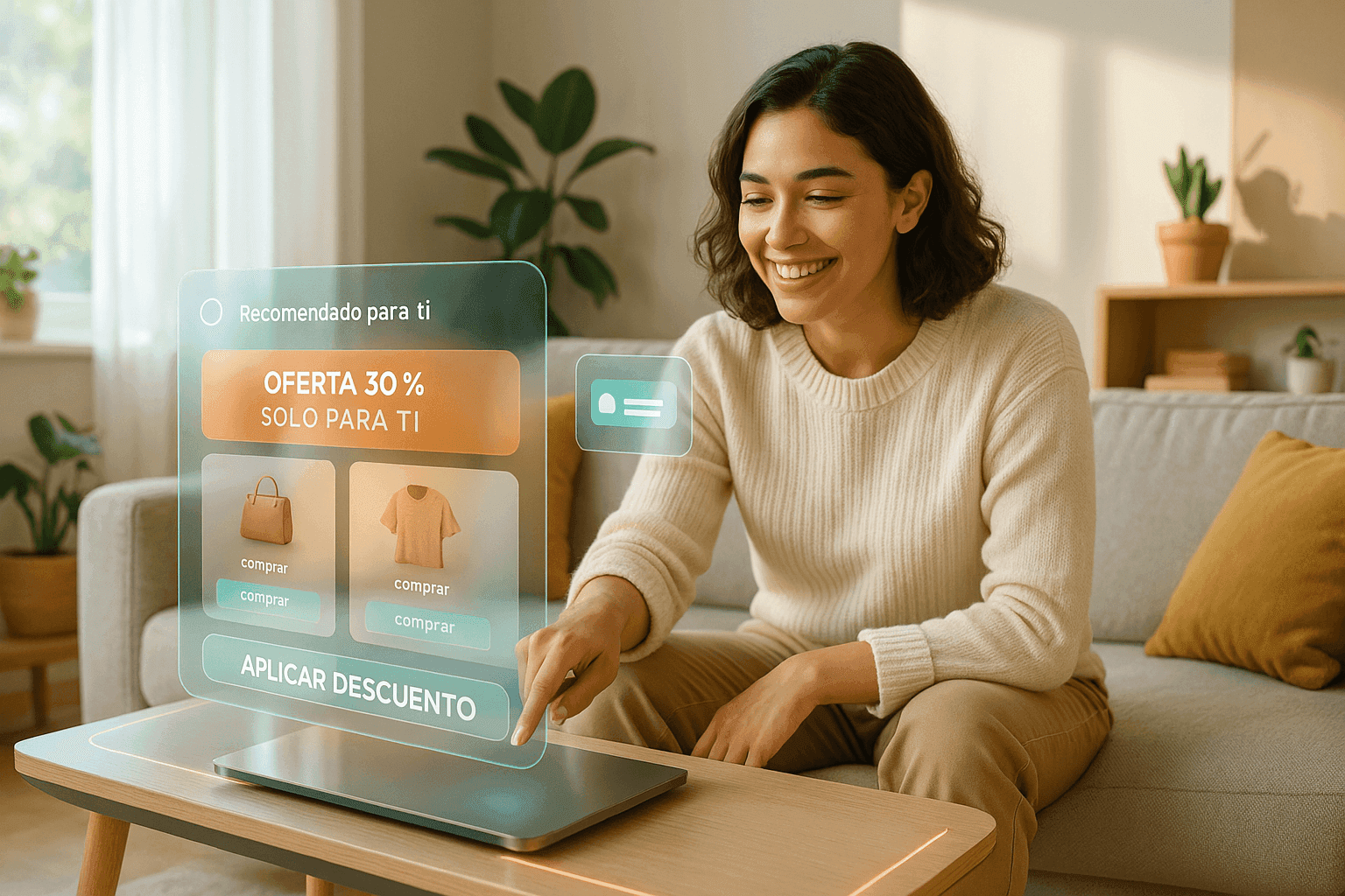
🎯 Selling your products on WhatsApp? Then you know every detail counts.
Just as the right color can boost your conversions in your online store, instant, effective service can make all the difference in your chat sales. yavendió! is the AI-powered sales agent for ecommerce businesses that serves your customers, recommends products, and closes sales on WhatsApp, even when you're not online.
Now, if you want to go a step further, you can use an artificial intelligence (AI) agent that not only describes your products, but actually sells them from the very first “hello” all the way to final payment.

More than 100 online businesses already use it to sell more, every single day. Ready to try it? Message yavendió!sita, our official AI agent, and get a free demo today.
Ready to sell more with AI?
Create your free AI agent in minutes. No card. No install.